


Logo Design:
New liquid Iron Supplement enters the UK market
Project Overview:
Ferrosix is a liquid iron supplement that aims to provide a convenient and effective way for people to meet their daily iron requirements. As part of its branding efforts,
Ferrosix required a new logo design that was recognisable and stands out in a crowded market
whilst not being overpowering and easily indicates its function as a supplement.

Discovery:
We conducted a discovery call with the client, where we outlined the challenges and limitations, such as a logo which
appealed to a broad audience and remained identifiable and legible
when used on compact packaging.

Market Research:
Through extensive market research, we
discovered both ineffective and effective visual directions
for liquid iron supplements in the current market. This research was essential in helping us outline a clear direction for the Ferrosix logo design and create a product that stands out from its competitors.

Ideation:
To ideate, we conducted a keyword analysis based on the product,
which led to us explore a variety of reflective iconography and typefaces partnered together to convey the qualities of the product.
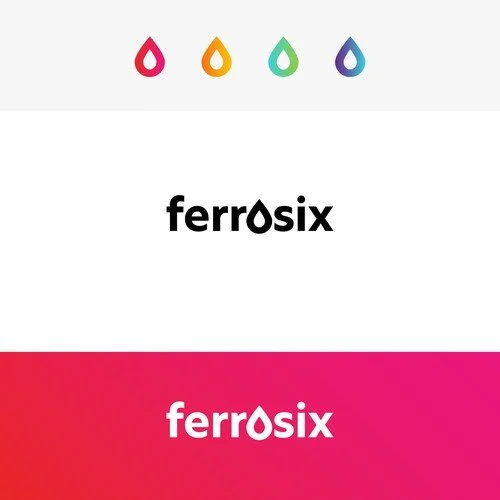
Outcome:
The final logo effectively
communicates the core qualities of the product
which include its gentle and liquid form. The palatable colour scheme, includes bold and appealing colours, which added to its distinctiveness.